

Overview
This project involved developing a comprehensive branding package for Nan Sterman's Garden School, a community-focused educational platform dedicated to fostering a love for gardening and promoting sustainable practices. The branding encompassed the creation of a logo, color palette, typography, and visual elements that effectively communicated the brand's mission and values.
Key Deliverables
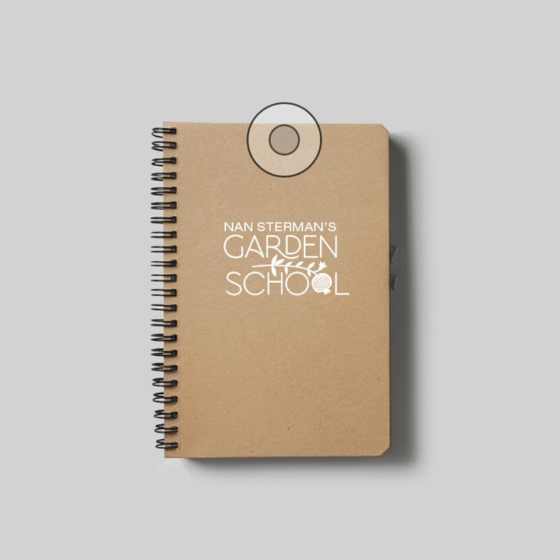
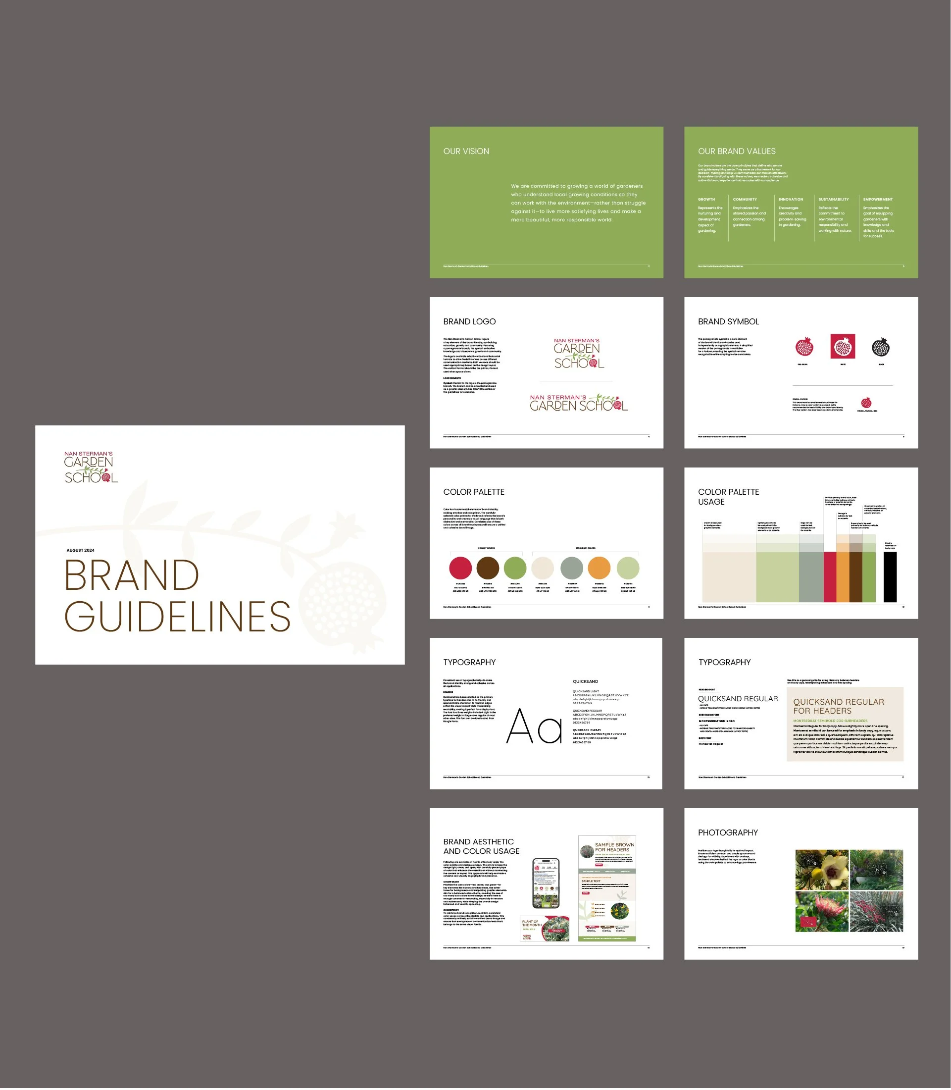
Logo Design: Developed a distinctive logo featuring a pomegranate branch, symbolizing knowledge and abundance, with leaves representing growth and community. The pomegranate element tied the Garden School to the parent brand while creating a unique and modern identity.
Brand Identity Guidelines: Created a comprehensive document outlining the brand's vision, mission, values, and visual identity. This included guidelines for logo usage, color palette, typography, and overall aesthetic.
Branding Strategy: The branding strategy focused on creating a welcoming and educational atmosphere that reflected the Garden School's mission. The color palette incorporated earthy tones, and the typography was chosen for its readability and modern appeal.
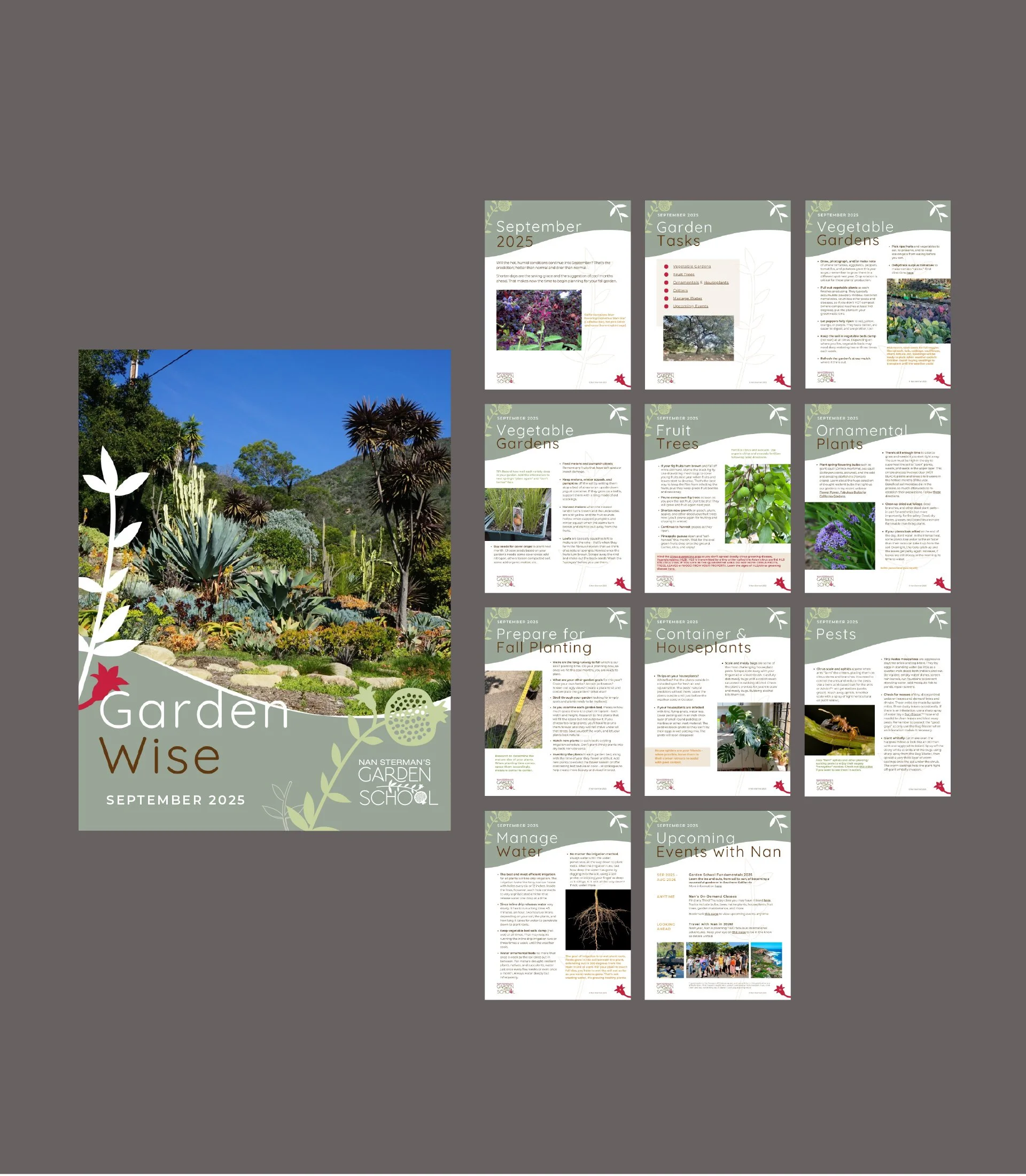
Custom templates: Designed a full suite of branded Canva templates — from brochures to social, video, and Facebook — so the team could easily create polished, consistent communications on their own..
Results
The branding package successfully captured the essence of Nan Sterman's Garden School, creating a visually appealing and memorable identity. The branding elements helped to position the Garden School as a modern, engaging platform, attracting a wider audience and reinforcing its commitment to education and sustainability.